
5 Great Market Research Podcasts from 2020 You May Have Missed
August 18, 2020
Intellicast S3E40 – Talking Cannabis Research with Arundati Dandapani of Generation1.ca
August 25, 2020Visual Presentation and Its Impact on Respondent Experience and Data

Ionic Columns at Jefferson Memorial, Washington DC Architecturel
Survey designers take care when building a survey to ensure certain types of questions are used, the order in which they are asked, etc. But at times, the visual presentation of the questions to respondents is overlooked, to the detriment of the data.
In this blog, we are exploring the impact that the visual presentation of questions has on respondents’ answers.
There are many factors that can affect the way a respondent answers a question, including how you display the question in the survey.
Rows vs. Columns
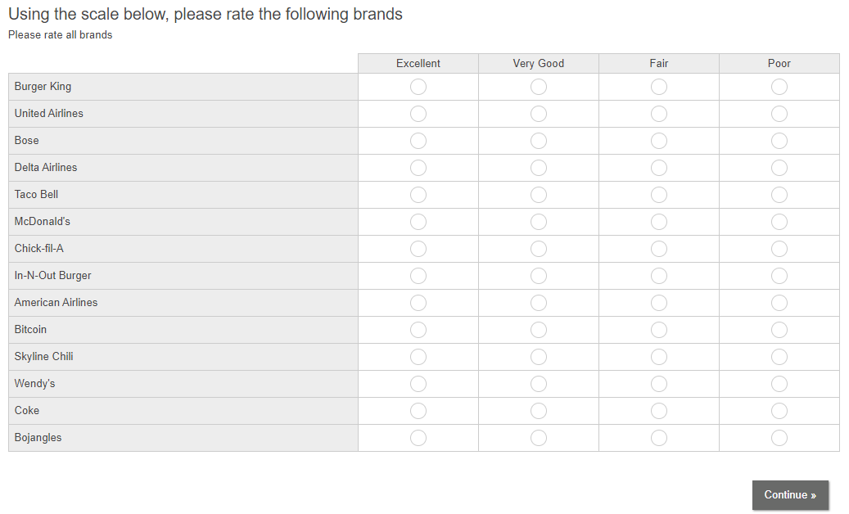
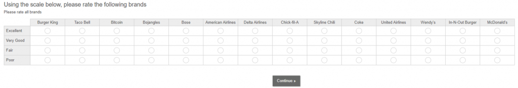
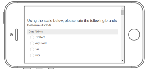
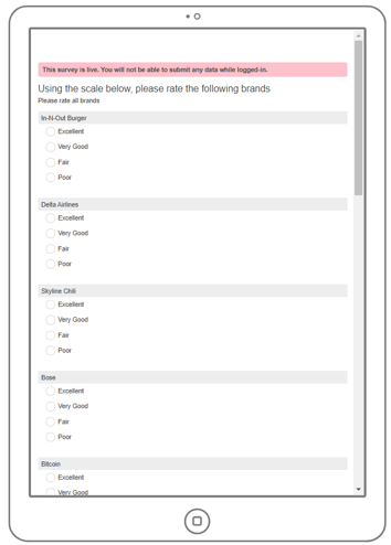
For the brand rating question that we asked in our Research-on-Research study, there were two ways to display the question. The question could either list the brands in rows down the screen or list the brand in columns across the screen. Here you can see examples of what each would look like.
Rows:
Columns:
Blending these two formats ensures that the data most accurately represents the true feelings of respondents.
The chart below shows results from more than 10,000 respondents from our 2020 Research-on-Research study. Displayed is the top 2 box Brand Ratings by the format of the question– rows vs. columns.
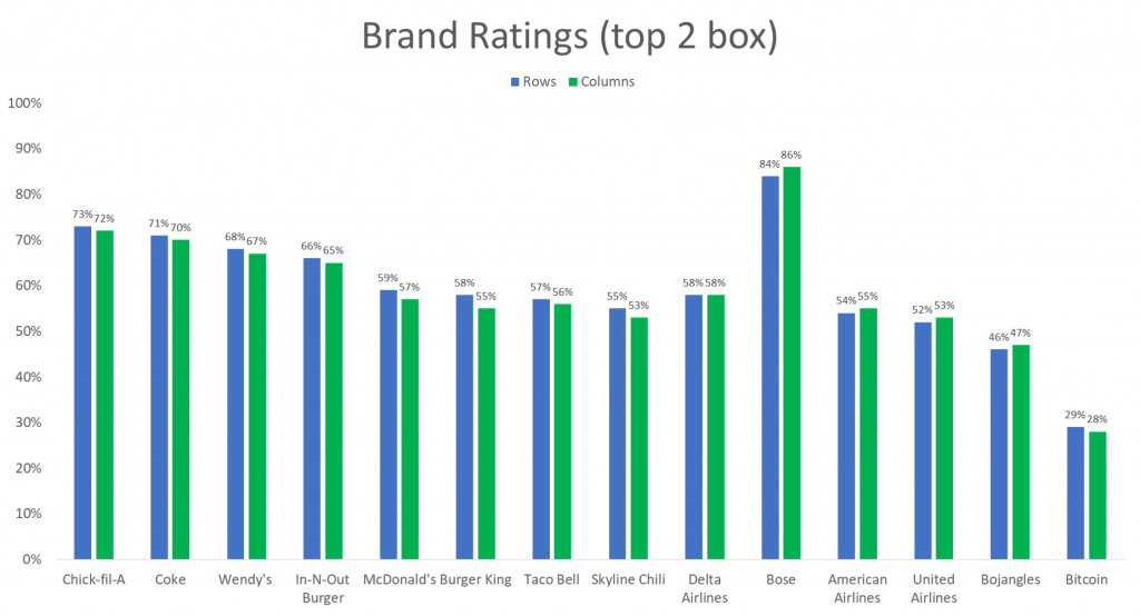
Overall, respondents who receive the brand ratings questions in rows are slightly more likely to rate the brands higher than respondents who receive the questions in columns.
Although the difference may not look significant, the data would be overestimated if all the respondents were presented the question in the rows format and underestimated if they presented the question in the columns format.
We decided to take a deeper dive into the data and see if the device on which the respondent is taking the survey has any effect on the responses as well.
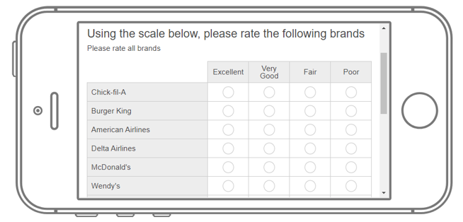
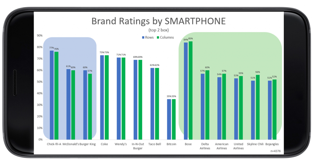
Smartphone
For respondents who completed the survey via a smartphone, they were slightly more likely to rate brands higher when the question was presented in column format, contrary to the total data above.
As much as a 5% difference (Skyline Chili.)
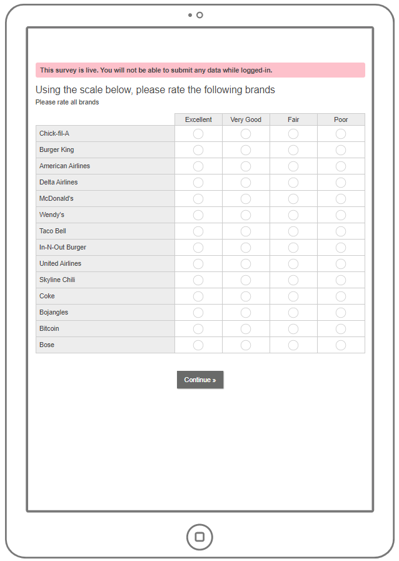
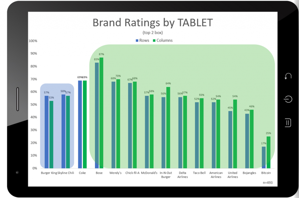
Tablet
For respondents who completed the survey via tablet, respondents were much more likely to rate the brands high when presented in column format, also in contrary to the total data above.
As much as a 9% difference (United Airlines.)
Desktop
On the other hand, respondents who completed the survey on desktops are more likely to rate brands higher when the questions are presented in rows.
As much as an 8% difference (Skyline Chili.)
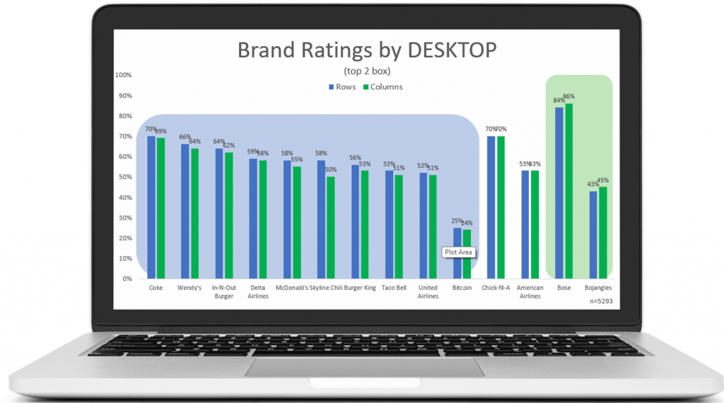
Because most respondents completed the survey on a desktop (more than the smartphone and tablet users combined by over 400 respondents), this data has the largest impact on the total data.
Why do smartphone and tablet users rate brands higher in columns and desktop users rate brands higher in rows? Do larger screens make it easier for respondents to answer on the higher end of the scale for rows? Does a smaller screen make it easier to scroll to view the rest of the question?
No matter what, the way you display your question on any device has an impact on how the respondent will answer the questions. That is why is it key to blend both formats to get a combined dataset that will most accurately reflect the feelings of the respondents.
To read more about data quality, check out our Data Quality series! Follow these links to learn more:
An Introduction to Data Quality Checks and Their Use Determining Data Quality
When It Comes to Data Quality—Not All Panels are Equal
Data Quality—Demographic Differences
Changes in Attitudes and Behaviors and How they Impact Data Quality
What Open Ends Can Tell You About Data Quality
Recommendations and Best Practices for Improved Data Quality


